Posts

Showing posts with the label Project

Semester Reflection Project

Image
I think this project was the hardest. I think this was the hardest because I really struggled and I did this project wrong. I had a hard time trying to erase the extra. I think this project was one of my strongest because It was really easy and It was super fun. I also really liked the product. I think that the Pop Art Tutorial was one of the best and so was the merge project. I feel like I learned the most from this project because of all the feedback I got on this photo. The feedback was both negative and positive some people didn't even think I did anything to it because the kitten's eyes are a dark brown. I feel liked I learned the most from this because all the feedback. These are my favorite homework images because I think they are the best images I have taken. I think this because I really like the end product. This semester I learned how to use Photoshop. I grew because I feel that I am taking better photos now than I was ove...
Learning Photoshop-Projects 3

Image
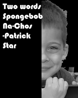
The third photoshop project I did was a text portrait poster. I used an image of my nephew and I used a quote from Partick Star.

Learning Photoshop -Project 2

Image
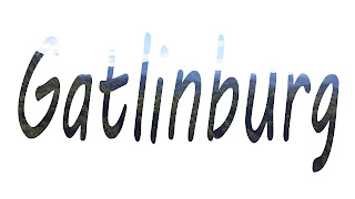
For my second tutorial I used the image within text tutorial. The image I used was an image I took in Gatlinburg, TN. So for this I typed Gatlinburg and it has scenery of the mountains.

Learning Photoshop- Project 1

Image
For my first project I used the Masking 101 tutorial and I liked it a lot. The tutorial was very easy.

Perspective-Project

Image
We were assigned to make images in photoshop to design our perspective on the world. For my first image I choose to merge 3 photos together. These photos were of flowers and an arch with a heart. I choose those 3 images because I wanted to show how we should love and cherish nature. For my second image I choose to use the emphasis tutorial to make the door in the image the only color in the photo. I choose to do this because I think it shows how boring life would be without color.

Extra Project

Image
For my extra project I edited 2 images the top one I just played around with the gradient map in Photoshop. In the second image I followed the Pop Art tutorial we did in class.

Conceptual Self Portrait

Image
For this project we had to take an image that symbolizes us and adjust it in Adobe Photoshop. Thus, I took an image of my cat. I decided to take a picture of  my cat because she is sweet. The only plan I had for this was to make her pink because I feel like pink shows sweetness.To do this I just went to the adjustments and played around! I really enjoy the outcome of this photo I feel like it symbolizes her and me.

Choice Tutorial Project

Image
The top image is my original photo and the bottom is my modified photo. For my choice project I found multiple tutorials showing how to change the color of objects in a photo. I decided to make the sky different colors because sometimes I get bored of the regular blue sky so I decided why not make the sky red, but I didn't want it to look like the end of the world so I thought pink might be a more suitable color. Thus I decided to make the sky look like a very colorful sunset with pink,orange, and with a hint of purple.

Pop Art Project

Image
For this project we had to use different filters to create a unique and interesting Pop Art image.For this project I used a pink flower. These filters made the image look really cool and it made the image look like an Andy Warhol piece.

Merge Project

Image
 For my merge project I was asked to merge 3 images. I merged 3 different colored flowers to make one beautiful pink and purple flower.

Emphasis-Project

Image
For my emphasis project I choose a kitten and I made the eyes the only thing with color.

Combine Brinkman-Project

Image
In photoshop I combined a image of a jade tiger and a pink flower.

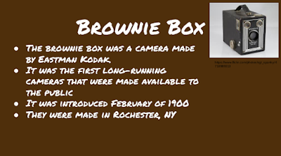
Photography History Brownie Box-Project

Image

Photo Editing Apps-Projects

Image
The apps I used were Pixlr and AIR Camera. AIR Camera had some great filters but I tried to make only one color stand out but it turned out really bad. I tried it again but with a different picture (The purple flower) and it looked bad when I singled out the purple but when I did it with the green it looked fine. AIR Camera also drove me crazy with ads it would send them to my phone as notifications almost every 10 minutes! I favor Pixlr out of the two because they had a lot more interesting filters than AIR Camera.However, it was a little difficult to use because you had to go through each folder to find something because they only labeled with pictures and not words but they didn't have any ads sent to my phone and that is important to me because I dislike ads very much .